Tuesday 14 December 2010

IPAD 2 AVAILABLE IN CHINA? No.. just a good clone!

Cloning a device before its launch is something that happens in China, although usually such a product is the result of speculations and wishful thinking. This is the case of the following “iPad 2″, that was recently spotted in Shenzhen and already got the title of best iPad clone so far

We’re dealing with an unit that runs Android 2.2 and packs a 9.7 inch display, plus a series of reasonable specs available below:
  • CPU: 800MHz, ARM Cortex A8
  • Memory: 512MB DDRII, 4GB flash
  • Display: capacitive touch, 1024 x 768, IPS technology
  • Connectivity: WiFi, 3G
  • Camera: front camera
  • Battery: 3800mAh
This slate lacks an SD card slot, but at least it comes with a SIM card slot, a 30 pin connector, 5 speakers and a removable antenna at the back. Its price is pretty reasonable, considering the specs: $277, so we wonder if you’ll take a trip to China only to get one.

Monday 13 December 2010

Apple iPad 2!!


The internet loves Apple and it loves ill-founded speculation, so it's hardly surprising that iPad 2 rumours were flying before the first iPad even reached the UK.
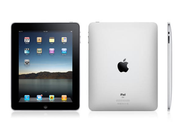
With only weeks to go before its expected unveiling the iPad 2 release date, specs and price are still closely guarded secrets, but that doesn't mean there aren't some juicy rumours, inspired guesses and possibly even Apple leaks to consider.
Here's our pick of the latest iPad 2G rumours.
iPad 2 specs: cameras and a gyroscope
Gizmodo reckons that FaceTime support's a given, and that means a front-facing camera like the iPhone 4. BuzzBizzNews echoes the camera story, suggesting twin cameras. It also suggests that there'll be a three-axis gyroscope like there is in the iPhone 4. EETimes says Apple has been testing gyroscopes but decided not to put one in the original iPad.
On 10 December 2010, images of a new iPad case appeared online, suggesting that the iPad 2 will feature a rear-facing camera.
iPad 2 specs: a USB port and SD card slot
Rumours suggest that the iPad 2 will have a USB port, which BuzzBizzNews says will enable users to "upload movies, documents and photos". We're not convinced it's for that, because Apple is moving increasingly to wireless. The iPad prints wirelessly. The iPad streams media wirelessly. Why add USB? More likely, we think, is a MicroUSB port or adapter so the iPad meets new EU regulations on mobile device chargers.
Images of a new iPad case have appeared online that seem to show space for an SD card slot.
iPad 2 specs: GSM and CDMA
AllThingsDigital quotes analyst Brian Blair, who says that Apple may be readying a "world iPad" that uses both GSM and CDMA networks, enabling it to get online anywhere in the world. CDMA, incidentally, is the technology used by Verizon in the US.
iPad 2 case: thinner and more like a MacBook
Brian Blair also says: "the new iPad is thinner than the existing model and is essentially made from one piece of metal with no pins needed. We understand it requires a new type of manufacturing process as a result, similar to the company's unibody approach seen in MacBooks."
iPad 2 specs: retina display
Will the gorgeous screen from the iPhone 4 make its way to the iPad? The Apple Blog thinks so: "You can be sure that Apple's Retina Display, or something very close, will make its way to iPad".
Then again, such a screen would massively increase the number of pixels, increasing the demands on both the iPad's processor and its battery, so a nine-inch Retina Display is a challenge. If Apple's solved it we'll see you down the Apple Store the second it goes on sale.
iPad 2 specs: a seven-inch screen?
All of Apple's rivals have plumped for 7-inch displays, which means their tablets are lighter than the iPad. Will Apple follow them into seven-inch territory?
iLounge says prototypes exist, while earlier this year DigiTimes predicted not just a seven-inch iPad 2, but a 5.6-inch iPad 2. Apparently the smaller iPads would target ebooks while the current iPad would target multimedia entertainment, "sources stated". We're doubtful. Apple already does a mini-iPad with a retina display. It's the iPod touch.
The idea of a smaller iPad 2 took another knock in November, when 9to5Mac reported that the iPad 2 adverts have already been shot - with current-generation iPads playing the role of iPad 2s. The iPad 2s will be digitally added nearer the time, and of course that's much harder to do if the iPad 2 is smaller than the iPads the actors are actually holding.
iPad 2 specs: a faster processor
KitGuru "has been hearing rumours from the Far East" that the iPad 2 will be a seven-inch job with a 2GHz processor and an HD video camera. It reckons the processor will be based on ARM's Cortex A9, the 1GHz dual-core processor that you'll find in the BlackBerry PlayBook.
iPad 2 specs: more memory
This is a no-brainer: the iPhone 4 has twice the memory of the iPad (512MB compared to 256MB), largely because the iPhone does multitasking. Since the iOS 4.2 release, iPads do multitasking too. 256MB already seems a little bit stingy.
The iPad 2 release date is probably in the Spring
Rumours suggested that the iPad 2 would be rushed out in time for Christmas, but if that's Apple's plan they're being awfully last-minute about it. Early 2011 seems like a much better bet, and it fits with Apple's annual product cycle: the first iPad was announced in January and shipped in the spring.
On 7 December we reported on rumours that Apple would be shipping iPad 2 units out to warehouses in February 2011. If that date is correct, it suggests an iPad 2 release date of some time around April.
The iPad 2 price won't change much
Unless there's a new seven-inch model we'll be amazed if the iPad 2 price is dramatically lower than the model it replaces: Apple isn't struggling to shift units and rivals are charging similar prices. Cheapo tablets do exist, but they're rubbish.

Top 3 Android phones to compete with iPhone!

With an Operating System that was more popular than Apple's last time we looked - Google Android phones are big and growing quickly. The software is made by Google but gets embedded in phones from all over the price range. Here are 3 of the top offerings, all capable of rivalling the iPhone 4.
Skimming down the list, the big-hitting Android phones are largely made by Chinese manufacturers HTC, though we also have a contender apiece from Sony Ericsson and Motorola. Lots of more affordable Android handsets are made by the likes of Samsung
Compared to the iPhone Android weaknesses tend to be the battery life - the high-functioning phones will eat through the energy unless you turn off functions like push notifications.
Arguably the Android app store's easy-going attitude to apps means that there's no quality control and the variety of handsets means that some apps can render weirdly. 
The strengths? Well they are usually cheaper, there's greater choice of handsets and contracts and Android apps are on average cheaper than iPhone ones. Oh yes and you're not tied into iTunes and as far as we know, the other phones don't have aerial problems.


1st. Nexus S (Google Phone)


2nd. HTC Desire

3rd. Sprint HTC Evo

Sunday 12 December 2010

Apple iOS 4.2 available now for iPad, iPhone and iPod touch

iOS 4.2, the latest version of the world’s most advanced mobile operating system, is available now for download for iPad, iPhone and iPod touch. iOS 4.2 brings over 100 new features from iOS 4.0, 4.1 and 4.2 to iPad including Multitasking, Folders, Unified Inbox, Game Center, AirPlay and AirPrint. “iOS 4.2 makes the iPad a completely new product, just in time for the holiday season”, said Steve Jobs, Apple’s CEO. “Once again, the iPad with iOS 4.2 will define the target that other tablets will aspire to, but very few, if any, will ever be able to hit”.

Blackberry curve 3g review- Cheap,durable but BORING!


There’s no getting around the fact that the Curve 3G is nothing but a minor bump. Aside from the much-needed jump to faster mobile network speeds, pretty much everything else remains the same as the year-old  Blackberry Curve 8520.The screen is still 320 x 240 pixels, the back still ruggedised and the nifty trackpad still sits pretty in the centre. The chrome finish of the original Curve returns though, adding a classier feel to what was always meant to be a basic version of RIM’s email workhorse.

BlackBerry Curve 3G: Connectivity updates

3G is the number one new inclusion and it has to be said it makes using the Curve an altogether more pleasurable experience. Zipping around web pages is much quicker, although the browser in the BlackBerry 5 OS is still pitiful. As we found on the original Curve 8520 back in 2009, zooming is a nightmare and pages are poorly rendered thanks to the low-res screen. Get over those blocky pixels though and the load speeds certainly impress.

The speedier HSDPA also means loading up apps from BlackBerry App World is far swifter and makes this phone a bit of a winner. Other phones in its price bracket don’t have the same nous when it comes to apps, although we have to say the App World itself is very unintuitive. BlackBerry OS 6 should fix this and the Curve 3G is being primed for an update according to RIM. Why it couldn’t load it up from the get go though, remains a mystery.

BlackBerry Curve 3G: Email and messaging

Email, though, is the main focus here. But little has changed in the way the Curve handles messages. You still get integrated folders and quick access to your mail, but rivals have stolen a march on RIM. Nokia’s E-series handles mail every bit as well, and even Espoo’s C-series cells match it. The QWERTY is also an acquired taste and in an age where virtual keyboards and more capacious sliders are ever more prevalent, the Curve 3G feels uncomfortable. After five minutes on this panel, your thumbs feels more cramped than a rush hour tube train.

Nothing has changed from the Curve 8520’s multimedia offering either. The camera is still an utterly naff two megapixel version which just doesn’t stack up against myriad rivals. Even the most basic phones can offer better snaps than this. The music player remains functional though and the App World’s excellent 7Digital app makes it a fine rival to the iPhone’s iPod app. Video playback is a shocker though and is something we wouldn’t recommend trying too often. However, the Curve 3G’s battery life is stellar, lasting two and a half days before we needed to give it some juice.

The £280 SIM-free price tag is heftier than the far classier Nokia E72 and even RIM’s own Bold is only £40 or so more. Blackberry 6 may well make the Curve 3G classier, but in its current incarnaton this upgrade is one for RIM fans only.


iPhone 4 Review! A truly amazing phone!

Apple iphone 4 review
Apple's launch of the iPhone 4 has seen the greatest excitement for a new phone ever - and with HD video recording, a super high-res screen and ridiculously slim dimensions, it's not hard to see why.
But things are a little different now - not only was the iPhone 3GS something of a non-update to the iPhone range, but there are finally decent alternatives in the smartphone market, with the HTC Desire and Samsung Galaxy S leading the Android fight right to Apple's door.
Add to that the first major leak of an Apple product a couple of months before launch, and suddenly the iPhone 4 has a lot to do to impress.
At least Apple has unleashed the big guns for this effort - before we get into the headline specs, the design itself is a massive talking point on its own.
Jobs' chats on stage to unveil a new iPhone might have got a little repetitive (best this, magical that etc) but this is the first time since the first iPhone way back in January 2007 that we've seen a variation on the standard iPhone design.Gone is the traditional curved back and plastic exterior with slightly chunky dimensions; in is a chassis that's only 9.3mm thin at its thickest point and a new stainless steel and glass industrial design.
If you're an iPhone fan, there's a good chance you won't like the look of the iPhone the first time you pick it up - it's the same weight as the iPhone 3GS at 137g, but it's a lot smaller, with dimensions of 115.2mm x58.6 mm x 9.3mm, so it feels like a much weightier and compact model.
The edges are stainless steel, apparently forged by winged unicorns in an iceberg (or something) to be 10 times stronger than 'normal' steel.
The front and back of the phone are made of glass, which has also been treated to be a lot stronger than the normal variety we're used to seeing through and drinking out of.
This claim holds up - not only did we feel the need to drop the phone onto the floor a few times to test, someone nameless of the TechRadar team also knocked it out (an admittedly low level) window onto concrete - and not a scratch.
If you're the protective type, then you can buy an official 'Bumper' for the iPhone 4, which encases it in a small ring of rubber, if you haven't bought the handset only for its slim lines.
The chassis shape isn't the only different thing with the iPhone 4 - the whole ethos has been tweaked. For instance, no longer is there a slightly plasticky rocker switch to control volume on the left-hand side, as it's now two discrete metal buttons with '+' and '-' written on.
The volume silencer rocker switch is above too, but that has also undergone the uber-metallic treatment.
The top of the phone still holds the headphone jack, and the power/lock key. However, the 3.5mm port is now flush to the chassis, and the power button feels much nicer to hit than before.
There's also a separate microphone for noise cancelling next to this as well - we imagine a few people will be pushing paperclips in there before they realise that it's not for the SIM card slot.
At least Apple has remained consistent when it comes to the packaging - apart from a new graphic on the front to make 
So that means: a simple Apple USB cable, a three-pin plug adaptor and some headphones. The latter is the same old set from the year before: hands free and a function button on the cord, but slightly poor quality compared to a range of other buds on the market.
Apple iphone 4 reviewThe front still has that one iconic button, which is much nicer to press in the new chassis, it has to be said.The right-hand side of the chassis is still blank - no camera button sadly, which would have been nice given the extra effort Apple has clearly put into overhauling the photography system.Still, sleek is clearly still 'in' at the Cupertino HQ, and we can't say we blame the designers when you look at the lines.Actually, that's not true - the micro-SIM slot is hidden away here, rather than on the top. It's the same pokey key thing/slot system as before, but this time the SIM card is much smaller - Apple says to make more room for stuff inside, we say it's just to shake things up a little bit. Either way, we bet micro-SIMs become the norm before very long in all phones.
The bottom of the phone has the familiar Apple connector for charging and connecting and docking etc, and is flanked by another more microphone-y looking microphone slot and the speaker.
Overall, the design might not impress some people the first time they pick up the phone - a number of people we showed the phone to grimaced a little bit the first time they handled it.
It's a sharp and weighty-feeling phone, make no mistake - and it doesn't sit as comfortably in the hand as well as other iPhones of the past have.
But it feels premium, and at up to £600, it had better - that's a lot to pay when you consider you could get a 42-inch 1080p LCD for £200 less these days.
In the box
the new iPhone 4 look more mysterious, there's not a lot different to the older iPhones.

MacBook Pro Core i7 review!


While the MacBook Pro is just another Intel-based computer with standard internals, slightly inflated price tags, and a familiar (if legendary) design sense, Apple having the absolute corner on the market for building machines that legitimately run OS X can be a little rough on the upgrade obsessed. Waiting 10 months for a new computer, without an industry full of hungry competitors with wild alternatives to quench your thirst, can be difficult, and the January launch of Intel's new Core i5 and Core i7 chips for laptops further fueled the saliva. Still, Apple would like you to believe these new MacBook Pros with their 2010-ready internals and same-as-last-year good looks have been worth the wait. Find out for yourself in our full review after the break.


Look and feel
It's almost silly to talk about the look and feel of the MacBook Pro, because outside of the ExpressCard for SD card swap (grrr) and the sealed in battery (conflicted grrr), both of which happened in last year's refresh, the laptop has remained virtually unchanged externally for almost two years. Of course, that's not at all a bad thing. Despite many pretenders to the throne, Apple is still the class leader in looks, with an understated aluminum and glass design that isn't close to going out of style.

Still, we have a few gripes about the design in actual use that we wouldn't have minded Apple addressing in this round. First off, the sharp aluminum edges scream classy, but they also cut into the wrist when we're at an ergonomic disadvantage. We don't need pillows, but some mild concession to our human flesh would be nice. There's also the frustration of the too-close-together and too-few-in-number USB ports of the left side. It's one thing to have only two USB plugs, but when putting a thumb drive in one obscures the other you have a real problem. A standard HDMI port would also be nice, but we know Apple has its principles.

The other major problem we've had with previous generations of the unibody MacBook Pros is the use of the bottom plate as a secondary heat sink of sorts -- which turns our lap into a tertiary heat sink in the process. Happily we can say the situation has been much improved in the new version, at least in average use, though it's still possible to get the machine to uncomfortable temperatures with a little bit of effort. Sure, it's nice that there's hardly any fan noise ever, but at some point the laptop becomes hot on top as well, causing our left palm and wrist to sweat -- we'd say that's as good a time as any for the fan to kick into gear.

Keyboard, touchpad and screen
No big surprise, but we couldn't feel a single difference between the new keyboard and the last generation. We love the island keyboard aesthetically, but part of us still pines for those old, indented Apple laptop keys.

One of the biggest changes to the new models, as silly as it sounds, is the "inertial scrolling" Apple has added to the touchpad. This is very much like the motion on the iPhone (though of course you still use two fingers to scroll), or the motion available with some free-spinning scroll wheel mice, allowing the page to coast a little before slowing to a stop. It's completely intuitive, comfortable, and helpful, but if you loathe it for some reason you can turn it off in system preferences. According to Apple it's only a software change, but as far as this showing up on existing systems with glass trackpads, Apple's lips are sealed.

Sadly the review model we were provided doesn't have the new high resolution display option -- 1680 x 1050 instead of the standard 1440 x 900, which seems like a no brainer upgrade at $100 -- so we can't speak to that panel's quality. Still, our boring old pixel-poor display is still a pleasure, with 100 percent brightness often a bit much indoors, great color, and great viewing angle. Up next to our 6 month old previous-gen MacBook Pro, we'd say the colors are just a tad warmer and blacks just a tad deeper, but Apple claims the LCDs are at least specced exactly the same.

Performance, graphics and battery life

This is really where everything is at for these new machines. Apple's finally upgraded to the Core 2010 processors, which bring with them cores galore, along with Turbo Boost tech for automatic overclocking of the chip based on demand. Software utilization of multiple cores has come a long way, but it's still not perfect, so Turbo Boost switches off a couple of the extra cores when they're not needed to make room for overclocking of the remaining cores -- to pretty dramatic effect at times. We're testing out the top-of-the-line 2.66GHz Core i7 machine with NVIDIA GeForce GT 330M 512MB graphics, 4GB of RAM, and 500GB HDD, which retails for $2,199.

We aren't what you would call power users in a rendering-Pixar-movies sort of way, but we can still tax a machine just fine. We're usually running a couple browsers at once, frequently batch process piles of photos, edit videos the quick and dirty way in iMovie or QuickTime, and dabble with GarageBand from time to time. Slowdowns and hiccups are the norm on even the best machine with what we've got going on. Unsurprisingly, Core i7 hasn't made this all go away. Instead, it's just made it happen less. It's obvious that the machine can juggle just a bit more at once, launch apps a bit faster, pop open dialogues just a bit quicker, and so forth. Of course, this is all hard to quantify and is rather subjective, but we feel it.

To really bust on the processor more specifically we fired up some Flash video, pitting our new Core i7 Pro against an "old" MacBook Pro with a 2.66GHz Core 2 Duo processor and 4GB of RAM. Both machines are actually pretty strong when running a single bit of Flash at a time, but it's when a couple dozen tabs are open all slamming the processor at once that things get difficult. We fired up Hulu in 480p (the new Glee episode) and a 1080p Avatar trailer on YouTube with both machines managing to keep both videos playing smoothly. Once we added a second 1080p YouTube trailer on each machine, however, the Core 2 Duo machine began to choke, while the Core i7 juggled all three videos successfully.

On a more empirical front we ran some HTML and Flash tests using GUIMark. With Firefox 3.6.3 and Flash 10.0.45.2, we managed 21.31 FPS on HTML and 21.04 FPS on Flash on the new machine, while the old MBP only managed 15.99 FPS and 16.1 FPS, respectively.

We also tried out a 720p video export in iMovie. Of course the GPU gets called in for previewing live effects and whatnot, and we found the entire UI very responsive, but video exports are still a CPU affair, and the new machine thrashed the old one with a 5 minute export vs. 9 minutes.
Now to the issue of GPU switching. We had a long talk with Apple where they explained to us how this technology is different than Optimus (at least in the software implementation, it's obviously the same card underneath), and we're pretty impressed with what Apple has pulled off. Basically, Optimus turns on the GPU if its needed, and then runs both the Intel graphics and the discrete card simultaneously, pushing the GPU-produced imagery through the Intel chip before it hits your screen. Apple's solution actually switches fully between the cards seamlessly, with the Intel graphics on only in a power sipping mode but not in use at all for rendering when the NVIDIA GPU is in play. The other big difference is that Optimus detects its necessity based on a cloud-stored whitelist of apps that NVIDIA has, which could potentially become out of date or at least have difficulty in keeping up with app releases (though users get the flexibility of manually enabling apps). Meanwhile, Apple's solution is based on deeper OS-level stuff, with OS X figuring out what sorts of technologies an app is going to call on (like OpenGL, for instance) and turning on the GPU accordingly.

Still, there are drawbacks to even Apple's approach. For instance, a heavy hitter like Photoshop will turn on the GPU, even if you just leave it on in the background while you're working with some text. If you really want to sip power you'll have to quit any applications that use the GPU when they're not needed. The problem with that is that Apple isn't providing any way for people to know if an application is activating the GPU or not. We're sure there will be a 3rd party utility soon enough (Apple even agreed with our assumption), and we even understand why Apple might want to hide this info from Joe User, but we know plenty of power users who wouldn't mind having this info surfaced.

On a similar front, Apple has really outdone itself in restricting your GPU flexibility. There are only two options for automatic graphics switching: on and off. If it's on, it'll act as we've described, if switching is off then the GPU will run at all times. Apple says this only knocks the battery life down from 9 hours to 8, but since in real life we're not getting anywhere close to 9 hours of use, we're pretty sure we'd rather hang on to that "bonus" hour of juice at times and run integrated only. Part of Apple's reasoning is the fact that Intel integrated graphics are no match for the GeForce 9400M chip of last generation, but when you need to squeeze every last minute out of your battery, flexibility is key.
  • Luckily, most regular computing operations like browsing, writing, playing video (iTunes works fine with Intel's integrated graphics), and just hanging out work fine without discrete. In fact, one of the biggest GPU utilizers hasn't even hit the market as of this writing: Adobe's CS5 will make great use of the GPU, as do Apple's Aperture and Final Cut Pro. Games of course are the most reliant on a GPU, but unfortunately the state of gaming on the Macintosh is pretty abysmal. Your best bet is Boot Camp, and we haven't had a chance to give it a shot on this machine. As GPGPU computing (like the Apple-favored OpenCL) takes off, the GPU will be increasingly important to the average user, but for now automatic graphics switching is hardly an excuse for a regular Mac user to upgrade if they've already gone unibody.

So, how does all this added number crunching play out in battery life? Well, it's confusing, that's for sure. Since we don't have a reliable way yet of knowing when we're tapping into the GPU or not, it's hard to know exactly if what we're doing is helping or hindering battery life. Still, in regular use we're certainly not bumping past that magical 6 hour mark, and we'd have to really work for Apple's quoted 8-9 hours of battery. Through a day of "regular use," which involved some benchmarking and some iMovie, but mostly just web browsing and typing, with screen brightness hovering around 60-75 percent, WiFi on and an hour of Bluetooth we managed four hours and 34 minutes of juice. The video rundown test actually fared better, with five hours and 18 minutes of SD video with the screen at 65 percent brightness, WiFi and Bluetooth on. Those Intel graphics sure do sip power! Obviously what we assumed was "casual" use isn't so casual, and we'll be tweaking our usage of the laptop accordingly to figure out how much juice we can get -- until someone comes up with a hack to switch to integrated only, of course.
WRAP UP!
Basically, it's exactly what it says on the tin: a faster MacBook Pro. In fact, the biggest news here might be how little Apple is changing, or maybe the fact that the base model 15-incher is now $1,799 (instead of $1,699) due to the loss of an integrated-only option. It seems as if the tweaks Apple has made to the battery are more or less a wash, and while the added CPU power is certainly felt, there just isn't the necessary gaming contingent on the Mac to make the new GPU useful to most folks -- though the pro users that've been eyeing those pro mobile graphics cards available to their PC counterparts will certainly feel otherwise. Apple has carved an amazingly large niche out for itself by building incredibly expensive laptops incredibly well, and this generation is no exception, but we're not convinced there's enough here to warrant an upgrade for people who bit last year.

Saturday 11 December 2010

Nexus S (Google phone) available for pre-order.. But is it worth it?


First Impressions!

It’s easy to like the Nexus S, but we’re sure it will have its critics. It hasn’t leaped forward with screen resolution or processor speed, but that might not matter. The screen is an absolute star. It doesn’t have the resolution that the Apple iPhone 4 does, but we’re also quite glad that Google didn’t just step into a stats battle with its Cupertino rivals. Remember too that newer generation processors are more powerful than previous hardware clocked at the same speed, and the Android operating system is getting more refined all the time.
We still want to check out the little details like camera performance and how Android 2.3 performs when we actually get it integrated in to real life, but on first impressions, the Nexus S looks like a serious contender.

New features, ease of use, etc!

The Google Nexus S is the second Google phone to hit the market, the first Android 2.3 device. It has been designed and built by Samsung, whereas its forebear, the Google Nexus One, came from HTC. The Nexus One quickly appeared in another form as the HTC Desire with some minor tweaking, we’ve yet to see whether Samsung will launch a successor to its Galaxy S handset. We suspect it will.
Comparisons so far have been drawn between the Samsung Galaxy S and the Google Nexus S because it seems the most obvious choice. They bear some resemblance physically, as well as technically, but it’s not that simple. Get both phones in your hands and it becomes instantly obvious that they’re different. They feel different, they look different.
However, everything that sets the Google Nexus S apart from the Samsung Galaxy S seems like a logical evolution. The Google Nexus S is more rounded on its body, the screen is slightly curved and the bulbous bottom we saw on the Galaxy S is now slightly larger. The Nexus S measures 63 x 123.9 x 10.88mm and weighs 129g.


A more substantial change is the keyboard. Android keyboards come in many forms and the default that we’ve been using across past generations has been good. HTC’s Sense keyboard always offered more, as do the likes of SwiftKey and various others. Google has tackled this for themselves now and created a keyboard that feels more complete. It feels as though it acknowledges the sorts of thing that people are writing on a smartphone. Access to numbers is much better and the fresh look is welcomed too. We can’t really identify all the quirks in the keyboard with only a brief hands-on, but we came away feeling positive about it. 
One of the new features is the way text is selected and highlighted. Individual word selection happens in a flash, with draggable markers so you can easily place them where needed. The cursor placement gets a marker too. In truth, adding these sorts of features brings the stock keyboard up to date, with other platforms already offering this sort of convenience.

The Google Nexus S is also fast. Menus move with a fluid grace, apps open and close with barely a pause. Browser pages render, drag and zoom with the sort of elegance that you’d expect from a top-of-the-range smartphone. Of course, this was an unsullied device, it wasn’t loaded with contacts and apps like a device in the real world will be, so we’ll have to wait and see what the result is when it really gets put to work.
Around the back of the Nexus S you’ll find a 5-megapixel camera with an LED flash. There is a front facing camera too supporting 640 x 480 pixel resolution capture and strangely Google list the video resolution of the rear camera as 720 x 480. When we checked the device it didn’t state the resolution in the settings, so we’ll have to wait and see exactly what the deal is when we get a review sample in.
One of the other features that Google has been making noise about is the 3-axis gyroscope, aimed at giving developers something else to get to grips with, and should provide some interesting game support.


But this isn’t just design for the sake of design. When holding the Nexus S it was balanced and nestled down into the palm of your hand ready to be put into action. The squared cut of the Galaxy S just doesn’t feel as comfortable now, and the bulbous bottom on the Nexus S fits into your hand giving the phone support. Perhaps we’re a little over-excited about this, but it felt like the phone had been custom made to our very own hand. They say that cars are sold on basic things - the sound of the door closing, the feel of the steering wheel, the action of the seat belt pull. If Google wants to shift phones, then we think it's already taken a step in the right direction. That is if Samsung doesn’t then sell an identical version of its own.
From discussions that have emerged around the Internet, some are disappointed that the Nexus S doesn’t push the hardware boundaries forward. Some are calling for a 1.2GHz or dual core processor, some are dismayed by the lack of upgradable storage - you get your 16GB and you better be happy with it.
But the real point here is about performance. If the Nexus S can do everything you want with the hardware it has, do you need to wind up the numbers? Digital cameras ramped up their megapixels in incremental steps, but it didn’t always translate into performance. We’ve always argued that sheer processing power isn’t the be all and end all. Yes, it will step over a shoddy OS (like the HTC HD2 did with Windows Mobile 6.5), but it is software refinement that is more often the key to a device that works. The question that some will have is whether a device that toes the line at the top of the smartphone pile at the moment, will be able to hold its own as we ask more of our phones in the future.
The Google Nexus S runs the new Android 2.3. Visually it doesn’t look drastically different, but there are some slick little touches here and there that make Android a little more refined. There are also a few new changes to accommodate hardware and the inclusion of NFC support is the biggest change overall. Of course you need to be able to put this to some sort of use (which we didn’t get the chance to do in our hands-on) and at this point in time, we wouldn’t say it is a reason to buy a phone - not until there is a commonplace real world benefit.
But the little touches you will notice are things like pressing the standby button - and the screen blinks off like an old cathode ray tube. Get to the top or bottom of a list and you get a yellow burst to accompany the slight bounce you get. It’s a small detail, but effective at telling you that you’ve reached the bottom of that particular menu. The status icons across the top of the screen have been redesigned too.
The phone is released late December 2010. 

Pay as you go price:£549.95

BLACKBERRY TORCH REVIEW!!


Introduction

Whether or not you believe the new BlackBerry Torch 9800 from AT&T is as revolutionary as RIM’s TV ads imply, depends on what side of the smartphone divide you’re on. If you’re a current BlackBerry user, you’ll find the Torch a quantum improvement over RIM’s last touch-screen attempt, the Storm, and an amusing alternative to BlackBerry’s suddenly quaint non-touch interface. If you’re an iPhone or Android user, however, a few minutes touching Torch will make you chuckle patronizingly before returning it to its chastened owner. In other words, BlackBerry users will find it a huge step up, but it still won’t staunch the bleeding RIM continues to suffer from defections to the iPhone and Android phones.

Features and Design

Even though RIM touts the Torch as revolutionary, it’s a doppelganger of the Storm, only with the addition of a vertical slide-out keyboard – same size screen, same basic design and layout.
The Torch would have been revolutionary – or at least competitive – even a year ago, but now suffers badly in comparison with the latest wave of iPhone and Android superphones. It has just a 3.2-inch screen, the same size on the Storm, but now suddenly considered small, considering the iPhone has had a 3.5-inch display since for more than three years and the 4-plus inch screens available on the Samsung Galaxy S, Motorola Droid X and HTC EVO. A 600 MHz processor compared to the 1GHz engines on all recent superphones. VGA rather than HD videorecording. The Torch does offer a modern 5-megapixel still camera and 3G tethering – nice, but hardly comparable to the mobile hotspot capabilities of the Droid X from Verizon, or 4G hotspotting on the EVO and the upcoming Galaxy S Epic from Sprint.
BlackBerry is building its own App World app store, but the Torch also includes AT&T’s own AppCenter app store, which is slightly confusing.
BlackBerry’s biggest attraction has and always will be its highly responsive, sculpted physical QWERTY, but the Torch compromises this prime feature. To slide comfortably under the Torch’s top screen half, RIM flattened the keyboard, and as a result, the keys are nearly flush and don’t have Blackberry’s deep, firm response. Even though the keyboard is around the same approximate size as on previous BlackBerry slab phones, you’ll find now trying to hit ALT and the adjacent 7 key nearly impossible.

Multimedia

As compared to the iPhone and the current crop of Android phones, the BlackBerry’s Torch’s knack for dealing with music, photos and video is limited.
While smaller than current superphones, the Torch’s screen is nonetheless big and bright enough for casual video viewing. But MobiTV offerings are pixelated, and instead of a dedicated YouTube app, the YouTube icon instead simply takes you to the YouTube Web site, and I could find no way to watch videos in high quality, as you can on Android or iPhone. AT&T’s own video service doesn’t seem to be pre-loaded on the Torch, but you do get PrimeTime2G